Layout
You can configure a form using the mouse and the functions on the Layout toolbar.
Forms are opened in the form area. The title bar of the form designer contains the form name. An '*' is displayed if changes have not been saved yet.
Elements that you click on will have a dotted frame and sizing handles.
If you click on the form, you can use the mouse and the sizing handles to adjust the width and the height. The form has a horizontal, vertical, and diagonal sizing handle. If you drag the form beyond the borders of the window, the window will be automatically resized.
All mouse actions snap to the grid.
You can show/hide the grid and edit the grid size:
|
|
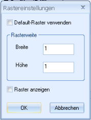
Open the Grid settings dialog using the button on the default toolbar, the Form menu, or the context menu. |
|
|
|
|
|
Enter a value for the width and height of the grid blocks. Select whether the grid is to be displayed. The grid size of '1 x 1' turns the grid off. Confirm the changes with OK. |
An area which you can use to store elements temporarily is located to the right and below the form.
Selecting and Positioning Dialog Elements
Dialog elements are created using the Dialog elements toolbar.
If you click an existing dialog element, it will open with a dotted frame and sizing handles.
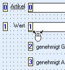
Text fields consist of two graphic elements: an input field and a label field. Both can be selected and moved independently from each other. If you hold down the Shift key while selecting an element, the other element will also be selected with sizing handles but it will not be hatched.
Multiple graphic elements can be selected using the mouse while holding down the Ctrl key. Each newly-selected element will appear with sizing handles and a dotted frame. You can also hold the mouse button to drag a rectangle around all elements you want to select. If you then click an element, it will also be given a dotted frame.
The size adjustment and alignment functions refer to the position of the dotted element.
If you click on a pre-selected object while holding down the Ctrl key, the selection will be removed.
|
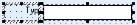
Hover the mouse above one of the selected objects to move them all together based on the grid, or use the cursor keys to move them point by point. |
|
If you have selected multiple elements, the properties window will only contain properties which can be collectively edited.
On the Edit toolbar, you also find buttons for cutting, copying, and pasting dialog elements.
Size of Dialog Elements
The size of an element is changed using the sizing handles. Selected elements have horizontal, vertical, and diagonal sizing handles.
|
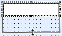
If you click and drag an element to make it larger or smaller, it will snap to the size of the grid. |
|
The size of images cannot be changed.
If you enlarge or shrink the input field of a text field, the property 'normal/multiline' will not change.
Enlarge or shrink the field in which the element is positioned when labelling text fields, static texts, radio buttons, and checkboxes. The elements are set to their default size. The field size is the reference point for aligning multiple elements.
|
|
The field size can be aligned to the size of the element by pressing the Match size with content button in the Layout toolbar. |
|
|
The height and width of multiple selected elements can be adjusted using the Match width and height button, the Match height button, and the Match width button. The reference size is always the size of the element with the dotted frame.
|


Aligning Dialog Elements
The positions of the dialog elements are aligned with the help of the features available in the Layout toolbar.
|
|
When aligning, all elements are aligned according to the field or element which has a hatched frame. |
|
|
You can align the left, lower, the right, or the lower frame of the selected element to the element with the dotted frame. |
|
|
You can center the elements horizontally or vertically. The reference point is the element with the dotted frame. |


In the Layout/Arrange menu, you can vertically and horizontally unify the distance between selected elements. You can choose to execute the function based either on the distance between the center lines of the elements, or the distance between the elements themselves.
Please note that there is no difference made between label fields and input fields when aligning and assigning them. If both are selected they will be aligned according to the same reference point.
Copying, Inserting, and Deleting Dialog Elements
Selected dialog elements can be cut or copied with the context menu or the button on the standard toolbar in order to place them anywhere else in the form or on a different form.
- Select the required elements.
- Choose Cut or Copy in the context menu.
- Open the destination form (if not the same).
- Choose Paste from the context menu.
- Click anywhere in the form.
The cut or copied dialog element will be inserted at the selected position. They retain their properties.
If the form already contains elements with the same name, the inserted element will have a number appended.
For text fields that have catalogs or add-ons assigned to them, you may need to modify the parameters after they have been inserted. Radio buttons require an associated group field.
Selected dialog elements are deleted using the context menu or the Del key. In text fields, both elements – the label field and the input field – will be deleted even if you only selected one of them.
Tab Position of Dialog Elements
The user can activate the dialog elements in the form using the tab key. When creating dialog elements, they automatically receive tab positions according to the order they have been created in. In the workspace the dialog elements are always positioned in the order of the tab position.
The tab order can be edited as follows:
- Open the form of an object on the desktop.
- Turn on tab mode using the Tab order button on the Layout bar.
The tab order will be displayed on the form. It starts with the position '0'.
- Click on the dialog elements in the exact order you want. For text fields, click the input field.
The assigned tab position will be displayed as a tooltip.
- Turn tab mode off again using the Tab order button on the Layout bar.
The tab order is now set to the exact order you have entered.
If you hover with the mouse above a dialog element, the assigned tab position will be displayed as a tooltip. Use the ↑ and ↓ keys to choose a different tab position. It will be displayed as a tooltip and assigned by clicking. The dialog element that previously had this tab position will have the tab position of the modified element assigned to.
The tab positions of graphic elements are ignored.
A group field and the assigned radio buttons must follow on each other directly in the tab order. The relative order of tab positions should no longer be edited.
 on the right.
 areas. Use the toolbar to show all hidden areas at once:
