Dialog Elements
Dialog elements are created using the Dialog elements toolbar.
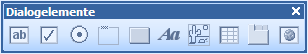
Click on a type icon and then on a form. A dialog element of the corresponding type is created. The properties are displayed in the properties window, where they can be edited.
You can create the following types of dialog elements:
|
|
Editable form field in which data can be entered by a user. |
|
|
|
Checkboxes are ticked ( |
|
|
|
Several radio buttons are grouped into a single group field. The user can choose an option. |
|
|
|
Group fields are used to group radio buttons. Group fields can also simply be used as a visual element. |
|
|
|
Scripts can be assigned to buttons in the event editor. Press the button to launch the script. |
|
|
|
Static text fields are visual elements. |
|
|
|
Graphics are visual elements. |
|
|
|
You can define the columns for tables. Users can create any number of lines. |
|
|
|
You can clearly group dialog elements using the tabs. |
|
|
|
These are windows on the form in which an URL can be opened. |
 ) using the mouse.
Text Field
Text fields have the following properties:
| Name |
The name must be unique on this form. |
| Field length |
Maximum number of characters for this field. The value '0' does not specify a maximum number of characters. A check must be performed in the project for assigned string variables to determine the maximum amount of data that can be processed in processes. |
| Position/size |
Use the layout functions to adjust the position and size of dialog elements. |
| Restriction |
A form restriction provides the structures for indexing. Enter the form definition in the Form row. |
| Mandatory field |
Mandatory fields must be completed by the user. They are underlined on the form. |
| Read-only |
Fields with the property Read-only cannot be edited by any user. They can be populated with add-ons or scripts. |
| Controlled by crosscheck |
Fields with the property Controlled by crosscheck are activated and filled in via structure tree catalogs or add-ons. |
| Catalog |
You can assign catalogs and add-ons to text fields. Select a catalog type or add-on from the list offered in this line. |
| Automatically execute add-on |
Certain add-ons can launch or be forwarded automatically when saving them if the user has not already done so. |
| Text field type |
Text fields can have one or multiple lines. A multiline text field makes sense for longer texts, for example, freely written text passages. |
| Label visible |
You can hide the label of text fields on forms. |
| Tab position |
The tab position of the element on the form is entered in this line. The position can be edited using the layout functions. |
| Tooltip text |
The text entered here will be displayed as a tooltip when the user hovers the mouse over this element. |
| Text color |
The text color for the entries is selected with the standard text color selection dialog. |
| Catalog tooltip text |
You can assign a tooltip to catalog and add-on buttons. |
Checkboxes
Checkboxes can have the following properties:
| Name |
The name must be unique on this form. |
| Position/size |
Use the layout functions to adjust the position and size of dialog elements. |
| Read-only |
Fields with the property Read-only cannot be edited by any user. They can be populated with add-ons or scripts. |
| Tab position |
The tab position of the element on the form is entered in this line. The position can be edited using the layout functions. |
| Tooltip text |
The text entered here will be displayed as a tooltip when the user hovers the mouse over this element. |
Checkbox names cannot be hidden or positioned independently from the checkbox. They are always placed to the right of the checkbox.
Radio Buttons
Radio buttons should always be positioned within group fields and must be positioned one after the other, with the group field in the first position.
Radio buttons can have the following properties:
| Name |
The name must be unique on this form. |
| Position/size |
Use the layout functions to adjust the position and size of dialog elements. |
| Read-only |
Fields with the property Read-only cannot be edited by any user. They can be populated with add-ons or scripts. |
| Tab position |
The tab position of the element on the form is entered in this line. The position can be edited using the layout functions. |
| Tooltip text |
The text entered here will be displayed as a tooltip when the user hovers the mouse over this element. |
Similar to checkboxes, radio button names cannot be hidden or positioned independently from the button. They are always placed to the right of the checkbox.
Group Fields
Group fields have the following properties:
| Name |
The name must be unique on this form. |
| Position/size |
Use the layout functions to adjust the position and size of dialog elements. |
| Label visible |
You can show or hide the label. |
| Tab position |
The tab position of the element on the form is entered in this line. The position can be edited using the layout functions. |
Radio buttons should always be positioned within group fields and must be positioned one after the other, with the group field in the first position.
Button
Buttons have the following properties:
| Name |
The name must be unique on this form. |
| Position/size |
Use the layout functions to adjust the position and size of dialog elements. |
| Tab position |
The tab position of the element on the form is entered in this line. The position can be edited using the layout functions. |
| Tooltip text |
The text entered here will be displayed as a tooltip when the user hovers the mouse over this element. |
Static Text Field
Static text fields have the following properties:
| Name |
The name must be unique on this form. |
| Position/size |
Use the layout functions to adjust the position and size of dialog elements. |
| Tab position |
The tab position of the element on the form is entered in this line. The position can be edited using the layout functions. |
Image
Images have the following properties:
| Name |
The name must be unique on this form. |
| Position/size |
Use the layout functions to adjust the position and size of dialog elements. |
| Tab position |
The tab position of the element on the form is entered in this line. The position can be edited using the layout functions. |
| Path |
Enter the path to the image. The path has to be entered in such a manner that the image is accessible from any workstation. |
Table
Enter the following on the Properties tab:
| Name |
The name must be unique on this form. |
| Position/size |
Use the layout functions to adjust the position and size of dialog elements. |
| Tab position |
The tab position of the element on the form is entered in this line. The position can be edited using the layout functions. |
| Tooltip text |
The text entered here will be displayed as a tooltip when the user hovers the mouse over this element. |
Define columns on the Table tab as follows:
Enter a column name and a data type for each column of the table and specify the maximum number of characters a user can enter into a cell with the Maximum field length field.
Data is stored as UTF-16 in Unicode installations, so only half the maximum size is available.
The maximum field length is only taken into account when assigning string variables. Columns that have the 'Date' data type and date variables are always ten characters long.
Specify the column width for the form layout, and choose an alignment in the column from the list box. Any column can be set as read-only.
Under Catalog you can specify whether or not to set up a list catalog for table columns.
List catalogs are created using the Catalog tab.
On the Catalog tab, enter the list values for the selected column in the field row by row. A new line is added by clicking the + icon or the Ins key. List values can be moved up and down using the arrow keys. Use the x key or x icon next to each line to delete lines.
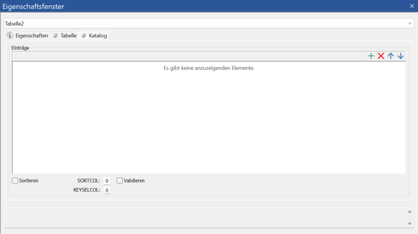
If you want to sort list catalogs in tables, you can do this based on the value in the first column or the list entry in the second column. The value of the first column is set to (SORTCOL=0) by default. The sorting can be placed on the list entry of the second column: SORTCOL=1. The preselection for entries via keyboard can be to consider only the first column (KEYSELCOL=0, default), only the second column (KEYSELCOL=1), or both columns (KEYSELCOL=2).
User entries can be validated. To do this, activate the corresponding option.
Page Control
Enter the following on the Properties tab:
| Name |
The name must be unique on this form. It will be displayed on the tab title. |
| Position/size |
Use the layout functions to adjust the position and size of dialog elements. |
| Tab position |
The tab position of the element on the form is entered in this line. The position can be edited using the layout functions. |
| Page number |
The page number lists the order of pages from left to right. |
A tab is generated when pages are being created. You can add more tabs using the context menu.
You can add dialog elements to the tab, but no additional page controls.
Web Control
Enter the position and size of the window and the URL to be opened.
 on the right.
 areas. Use the toolbar to show all hidden areas at once:
